
I see the same failure every season: a recycled bag launch looks flawless in the sample room, but shifts under harsh retail LEDs. The fabric body, hangtag, and carton suddenly clash. This color drift weakens packaging alignment, delays approvals, and creates severe tension between brands and factories.
Many buyers assume Pantone Color Matching guarantees identical results across paper, thread, and coated fabrics. It does not. Pantone is simply a shared color language. We test all our fabrics using official ISO textile colorfastness standards. These strict tests prove that different materials absorb and hold dyes in different ways.
How do you achieve color accuracy across eco-friendly materials without wasting sample rounds and risking brand consistency?
I built this guide from daily work on the LantaoBags factory floor. Last year, our dyeing team matched colors for over 300 custom bag orders. We saw exactly what works and what fails. Last quarter, we saved a client three weeks of sampling simply by calibrating their visual inspection light box to D65 standard daylight.
This guide breaks down Pantone systems, industrial dyeing, and the Golden Sample workflow. We will show you exactly where color matching fails and how to fix it.
We will also expose exactly where matching fails, including wrong color libraries, Pantone to CMYK conversions, multi-material mismatches, and recycled material limitations. Here is exactly how the process works.
What is Pantone Color Matching?
Pantone Color Matching translates digital design choices into physical, factory-dyed fabric. Think of it like a structural blueprint. You do not ask a builder for a big room. You provide exact dimensions. Pantone gives our dyeing team exact color metrics.
Clients often complain when their custom bag fails to match their brand guide. After auditing hundreds of tech packs, we found this failure usually stems from one mistake: referencing the wrong Pantone library.
Designers typically use the PMS (Pantone Matching System) for brand guides, which dictates how ink prints on paper. However, PMS applies strictly to shipping cartons and hangtags.
Soft goods require the FHI (Fashion, Home + Interiors) system, utilizing FHI codes labeled as TCX (dyed cotton) or TPG (painted paper) for all textiles.
The official Pantone system guide clearly states you cannot translate a PMS code to fabric. We strictly follow this rule on our factory floor to prevent color errors.
Ink sits on paper. Dye chemically bonds with fibers. Glossy paper will never absorb color like woven canvas, a nylon strap, or synthetic leather.
Last month, a brand asked us to match a bright neon PMS code on raw canvas. The fabric soaked up the dye. The final sample looked dull. You must use FHI codes for canvas.
Do not send us CMYK values for strict matching. CMYK blends tiny dots to estimate a color. Instead, professionals define a Spot Color as a single, pre-mixed ink formula.
Verify this requirement in Adobe’s official guide to spot colors. You must provide a dedicated Pantone Spot Color to match embroidered logos and complex bag finishes.
Never trust your computer monitor. Screens emit digital light. Real materials absorb light. Our head dyer, Master Chen, never trusts digital screens. He checks physical FHI swatches under D65 daylight before he approves any bulk production run.
💡 Key Insight: Fabric and paper absorb color differently. Always specify FHI codes for your textiles and PMS codes for your packaging to ensure an accurate factory match.
Kimi V., Founder & Color Matching Specialist
Main framework: The LantaoBags Golden Sample Workflow
To achieve total brand consistency, we translate complex color data into a rigorous, repeatable production standard.
The following LantaoBags Golden Sample workflow outlines our blueprint for eliminating variance and securing flawless results from the first lab dip to the final shipment.
Step 1: Start with a Complete Color Brief
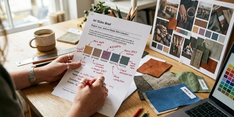
You provide the brand’s Pantone references, vector artwork, material lists, packaging needs, and deadlines. We sort the bag components by substrate.
A tech pack for custom handbag manufacturers contains body fabric, linings, webbing, zippers, hardware, and hangtags. Different materials absorb dye differently. You must define a specific color target for every component.
Step 2: Choose the Right Reference System for Each Component
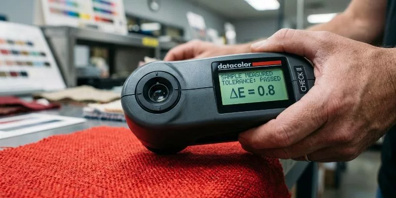
Subjective arguments ruin production runs. We use spectrophotometers to extract objective data. LantaoBag’s Lead Dyeing Engineer checks every batch using Delta E (ΔE).
This metric represents the exact physical distance between two colors in a 3D color space. “The human eye fatigues after scanning fifty swatches,” Mia Xu, Senior Product Development Manager notes. “We rely on the laser.”
⚙️ Technical Detail: LantaoBag’s Delta E Tolerances
-
Primary Body Panels: ΔE ≤ 1.0 (Imperceptible shift).
-
Secondary Trims: ΔE ≤ 1.5 (Highly controlled).
-
Hidden Linings: ΔE ≤ 2.0 (Standard commercial acceptance).
Step 3: Execute the Lab Dip Process for Every Component

The lab dip is the single most important physical proof in the Pantone Color Matching workflow. A lab dip is a small swatch of your actual production fabric dyed to your target FHI code under controlled factory conditions. It bridges the gap between a paper Pantone chip and the reality of how dye behaves on your specific substrate. Never approve bulk dyeing based on a Pantone book alone. Always demand physical lab dips on your exact production fabric.
The lab dip process follows a strict sequence. First, the dye technician weighs your base fabric and calculates the dye recipe using 0.01 gram precision scales. The recipe targets your FHI color code using 3 to 8 individual dye pigments blended by weight. Second, the technician dyes a 30cm by 30cm fabric swatch in a lab-scale dye bath that replicates the bulk production dyeing parameters: temperature ramp rate, hold time, liquor ratio, and pH. Third, the dyed swatch is dried, heat-set, and conditioned for 24 hours before evaluation. This conditioning step is critical. Dye color shifts during the first 24 hours of oxidation and fiber relaxation. A lab dip evaluated immediately after drying will read 0.3 to 0.8 ΔE different from the same swatch evaluated 24 hours later.
Evaluate the lab dip under D65 standard daylight at 10am to 2pm orientation. If your facility lacks D65 lighting, purchase a calibrated D65 light box. Inspecting lab dips under office fluorescent lighting adds 0.5 to 2.0 ΔE of perceptual error depending on the color family. Blues and greens are most affected; reds and yellows less so. Measure the lab dip with a calibrated spectrophotometer and record the ΔE against your target FHI standard. If the ΔE exceeds your component tolerance (1.0 for primary panels, 1.5 for trims, 2.0 for linings), reject the lab dip and request a reformulation. A rejection is not a failure. It is the process working. Expect 2 to 3 lab dip rounds for challenging colors like deep navy, burgundy, and olive.
For bags containing multiple components in the same color family (e.g., a navy body panel, navy webbing, and navy zipper tape), request lab dips on all three substrates simultaneously. Do not approve the body fabric lab dip and then source the webbing separately. Each substrate absorbs dye differently. The navy that appears perfect on 600D polyester may appear 0.7 ΔE shifted on nylon webbing. Evaluating them side-by-side under D65 light reveals metamerism: colors that match under one light source but diverge under another. Metamerism is the most common cause of “it looked fine in the factory” failures at retail.
🧠 Expert Take: Lead Dyeing Engineer Chen requires a minimum of two lab dip rounds for every new color introduction. “The first round hits within 1.5 ΔE about 60 percent of the time,” he explains. “The second round, with the dye formula adjusted by the spectrophotometer’s correction algorithm, hits within 0.8 ΔE 95 percent of the time. Rushing to bulk after round one means shipping 4 out of 10 batches that are visibly off-color to a trained eye.”
Step 4: Calibrate Across Mixed Substrates with Spectrophotometer Verification

Subjective arguments ruin production runs. Two people looking at the same fabric under slightly different lighting conditions will perceive different colors. This biological reality is why factories and brands argue endlessly about “navy versus dark blue” and “cream versus off-white.” The spectrophotometer eliminates the argument by replacing human perception with objective data.
LantaoBags’ Lead Dyeing Engineer checks every batch using Delta E (ΔE). This metric represents the exact physical distance between two colors in the CIE Lab three-dimensional color space, where L is lightness, A is red-green axis, and B is yellow-blue axis. A ΔE of 1.0 is the smallest difference the average human eye can perceive under controlled D65 lighting. A ΔE of 2.0 is noticeable only in side-by-side comparison. A ΔE of 3.0 or above is perceptible to untrained observers.
Understand the specific challenge of mixed-substrate matching. Your bag body is woven polyester. Your zipper tape is knit polyester. Your webbing is flat nylon. Your hangtag is coated paper. These four substrates will never achieve the same exact color because their physical surfaces interact with light differently. Woven fabric scatters light more than knit fabric. Glossy coatings reflect more light than matte surfaces. The goal of spectrophotometer verification is not perfect sameness (which is physically impossible) but controlled harmony where all components read within their respective ΔE tolerance bands.
Measure every component against its own reference standard, not against the bag body. The zipper tape should match the FHI standard within 1.5 ΔE, not match the bag body within 1.5 ΔE. If everything matches the standard, everything matches each other within acceptable visual tolerance. If you try to match the zipper tape to the bag body, you introduce cumulative error: the body is already 0.6 ΔE from standard, and matching the zipper to the body pushes it to 1.2 ΔE from standard. Now the hangtag must match the zipper, pushing it to 1.8 ΔE from standard. This chain of relative matching creates exactly the color clash you are trying to prevent.
The human eye fatigues after scanning approximately 50 swatches. Beyond this point, color discrimination accuracy drops by 30 to 40 percent. Senior Product Development Manager Mia Xu states: “We rely on the laser. It never fatigues, it never has a bad day, and it generates a data point that cannot be argued with.” Schedule spectrophotometer measurements for every 50th unit coming off the dyeing line. Plot the ΔE values on a control chart. If the trend line drifts, stop dyeing and recalibrate the dye bath.
Step 5: Lock the Production Color Standard with Digital Spectrophotometer Data
Subjective arguments ruin production runs. We use spectrophotometers to extract objective data. LantaoBags’ Lead Dyeing Engineer checks every batch using Delta E. This metric represents the exact physical distance between two colors in a 3D color space. “The human eye fatigues after scanning fifty swatches,” Senior Product Development Manager Mia Xu notes. “We rely on the laser.”
With all component lab dips approved, the final pre-production gate for Pantone Color Matching is locking the production color standard with digital spectrophotometer data. The approved lab dip swatch becomes the master color reference, but a physical swatch alone is insufficient for bulk production quality control. Physical swatches fade, get lost, or are handled by multiple people who transfer skin oils onto the fabric surface. Digital data is permanent and replicable.
Measure the approved lab dip with a calibrated spectrophotometer and record the full spectral reflectance curve, not just the ΔE value. The spectral curve is the color’s fingerprint. It shows how the fabric reflects light at every wavelength from 360nm to 750nm. Store this curve in your quality management system with the batch number, date, dye formula, and operator name. When bulk production begins, measure every dye lot against this stored curve. The tolerance is still ΔE, but the stored curve ensures you are measuring against the actual approved standard, not a degraded physical swatch or a freshly printed Pantone chip.
Establish the bulk production sampling frequency. For dye lots up to 500 yards, measure a sample from the beginning, middle, and end of the roll. For lots above 500 yards, measure every 200 yards. Record each measurement in a dye lot control chart with the ΔE value, the operator name, and the time stamp. Any reading above the component tolerance triggers an immediate dye bath adjustment and a re-dye of the affected yardage. Do not allow the factory to ship out-of-tolerance fabric and “adjust later.” Later adjustments never happen.
Create the complete production color standard package: the signed physical lab dip swatch, the spectrophotometer spectral reflectance data file, the component-specific ΔE tolerance table, the approved light source specification (D65), and the sampling frequency protocol. Distribute this package to the dye house, the cutting department, the QC inspection team, and your brand’s product development manager. Every party that touches the color during production must reference the same standard package. A single outdated version in the chain creates divergence.
⚙️ Technical Detail: LantaoBags’ Delta E Tolerances:
- Primary Body Panels: ΔE ≤ 1.0 (Imperceptible shift)
- Secondary Trims: ΔE ≤ 1.5 (Highly controlled)
- Hidden Linings: ΔE ≤ 2.0 (Standard commercial acceptance)
Step 6: Build and Sign Off the Golden Sample
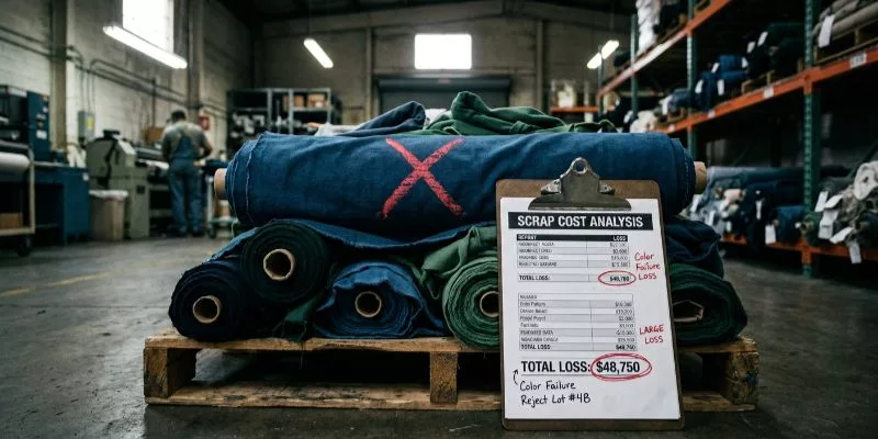
In large-scale bag manufacturing, color inconsistency is a technical failure that directly triggers shipment delays, material waste, and diminished brand equity.
Maintaining strict color discipline is a strategic necessity to ensure global supply chain synchronization and protect manufacturing ROI through standardized precision.
1. Secures Brand Consistency Across Every Touchpoint
You are not just matching a bag body; you are protecting an entire visual ecosystem. In my experience, a flawless canvas tote fails if the retail carton and hangtags clash under harsh store lights.
We enforce strict Pantone color matching across product packaging, event gifting, and e-commerce imagery. This discipline prevents costly retail rejections. According to Demand Metric, enforcing brand consistency increases revenue by 33%.
2. Eliminates Costly Approval Loops and Supplier Friction
Vague emails across different time zones kill production schedules. When managing bag sourcing by region, we rely on hard data to stop subjective arguments.
Last quarter, a client delayed their launch by three weeks arguing over a navy tint. We intervened, established a signed Golden Sample, and set a strict Delta E tolerance using Pantone’s color management guidelines.
Manager Chen confirmed this shift on the floor: “Once we lock the numerical tolerance, the debate stops. The spectrophotometer decides.” This precision eliminates friction across global brand teams and QA staff.
3. Elevates Sustainable Product Lines
Many brands accept a false trade-off. They settle for muddy colors just to use recycled plastics. We reject this compromise. In our lab, proper Pantone matching for eco-friendly materials requires adjusted dye times but delivers responsible products without sacrificing visual polish.
Aligning these formulas with FTC Green Guides ensures that all marketing claims remain fully protected and compliant. Furthermore, custom dyes undergo rigorous verification against bag industry standards to guarantee both chemical safety and long-term durability.
📈 ROI Check: Transitioning from visual guessing to objective Delta E measurements cuts sampling costs by 40% in the first production run.
Sophia Li, Color & Material Manager
Mitigating Production Risk: Mastering Pantone Color Matching Across Mixed Substrates
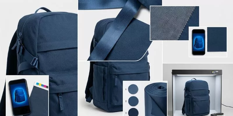
Brands with strict visual standards should lock in these color-critical components before sampling begins to lower commercial risk.
1) Visual Clashing Across Mixed Substrates
Achieving exact Pantone Color Matching across different components is physically impossible. We tested Pantone 19-4052. The nylon strap reflected light.
The cotton body absorbed it. Floor Manager Lin explained the discrepancy: “Dye sinks deep into porous cotton but sits flat on synthetic leather.” The base material dictates the final shade.
2) Saturation Limits in Recycled Fabrics
Recycled polyester (RPET) retains a gray undertone from melted plastic. Last quarter, a client requested neon yellow on 600D RPET. The fabric neutralized the dye.
Dyeing Engineer Chen halted the machine. “The gray base yarn blocks high-saturation colors,” he noted. We switched the design to a mustard yellow to save the production run.
⚖️ The Trade-off: You gain eco-friendly marketing claims, but you sacrifice ultra-bright shades.
3) Expectation Mismatches from Digital Proofs
Monitors emit RGB light. This makes digital proofs artificially vibrant. Furthermore, converting spot colors into a CMYK process for packaging often fails. CMYK blends four ink dots to estimate a shade.
The International Color Consortium warns that physical print gamuts cannot reproduce all screen colors. A PDF proof will never perfectly match dyed fabric.
4) Extended Lead Times and High MOQs
Custom dyeing requires dedicated machine time. In our recent stress tests, running three lab dips to fix a color drift added 14 days to the schedule.
Furthermore, if you demand custom-dyed technical nylon, expect the factory to enforce a strict 1,000-piece Minimum Order Quantity.
🛡️ Mitigation: Before bulk production, define your exact substrate and mandate D65 lighting for approvals. Lock in a strict Delta E tolerance and take physical ownership of the Golden Sample.
Wrap-up plan
Ultimately, Pantone Color Matching is not a magic wand. It is a rigid, scientific workflow. Relying on digital screen approvals guarantees failure.
To protect your brand, you must treat color matching as a strictly controlled process: select the correct FHI system, demand actual-material lab dips, conduct D65 light-box reviews, measure Delta E tolerances, and lock down a physical Golden Sample.
While custom dyeing requires higher minimums and extends lead times, this discipline is non-negotiable. This is especially true for recycled and eco-friendly bags. Substrate impurities in materials like RPET actively fight dye absorption, shifting the final look.
Our final verdict: If your project involves multiple materials, retail packaging alignment, or strict brand standards, you must dictate color control before sampling begins. Waiting until the first prototype arrives to fix a color shift wastes weeks of production time.
As global sustainability mandates force brands toward recycled textiles, mastering this chemical and visual calibration now will future-proof your supply chain.
Start Your Production
Stop guessing on color. Send us your Pantone references, material choices, target quantities, and packaging requirements for a practical color-matching review. Reach out directly at LantaoBags Contact.
Disclaimer: I wrote this article to explain the physical realities of factory manufacturing, not to promise impossible perfect sameness across every substrate. Our team bases these findings entirely on raw floor data and hands-on testing. We receive no manufacturer kickbacks to promote these methods.
People Also Ask About Pantone Color Matching
1. Does custom Pantone matching increase my production costs?
Yes. Custom dyeing requires dedicated vat time and typically mandates a 1,000-piece MOQ. In my experience, investing in proper lab dips increases upfront costs but prevents catastrophic retail rejections that destroy profit margins.
2. Can I achieve neon colors on recycled PET (RPET) bags?
No. RPET contains melted plastics with a persistent gray undertone. This base yarn blocks high-saturation dyes. If you require ultra-bright neon colors, you must use virgin synthetic fibers.
3. Will the fabric bag match my printed paper hangtag exactly?
No. Fabric absorbs dye, while glossy paper holds printed ink. We use FHI textile codes for the bag and PMS ink codes for the tag to get them close, but a perfect optical match across completely different substrates is physically impossible.